Content around everyday needs
We added explanations for computer work, reading, driving and other everyday situations. Visitors can start with the difficulty they are experiencing.

We expanded a simple presentation website with content that explains the options, gives an idea of prices and helps visitors prepare for a conversation with the optician.
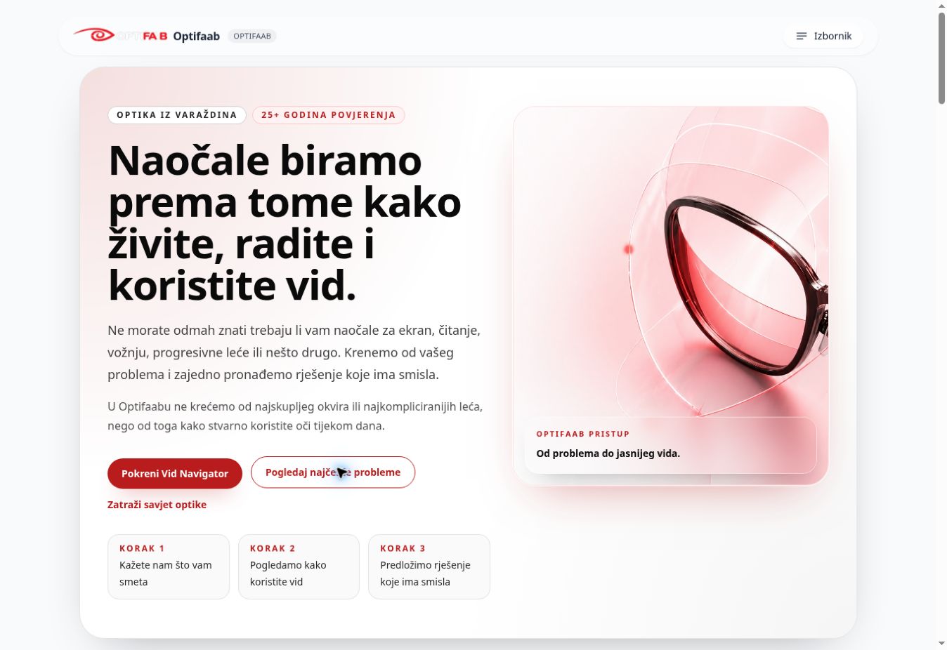
Optifaab had a basic presentation website with three pages. It did not provide enough room to explain the differences between glasses, lenses and the options a customer can choose.
Uncertainty about price and the visit itself was a significant barrier. People often do not know what they need, how much it might cost or whether they will understand the options offered.
Usage tracking was not active on the old website, so there was no baseline for a numerical comparison.
We designed around finding information and taking specific actions. Clear choices, connected information and straightforward steps towards contact use interaction patterns familiar from web applications.
This approach suits the purpose of this project. For other needs, we also develop more distinctive visual concepts within the agreed scope.
We added explanations for computer work, reading, driving and other everyday situations. Visitors can start with the difficulty they are experiencing.
We published indicative prices and explained what determines the final amount: from lenses and frames to additional coatings and adjustments.
An informational questionnaire helps visitors find their way to relevant content and contact. We connected the website to online appointment booking and established usage tracking. The Navigator does not replace a professional eye examination.
The optician has observed more online appointment bookings, inquiries and phone calls. As the previous website had no active measurement, we describe this change through the experience of the business, without growth percentages. We do not attribute the change solely to the website redesign.
Before visiting, people can now explore the options, get an idea of the cost and prepare their questions. The website supports a clearer conversation and choices based on each person’s actual needs.
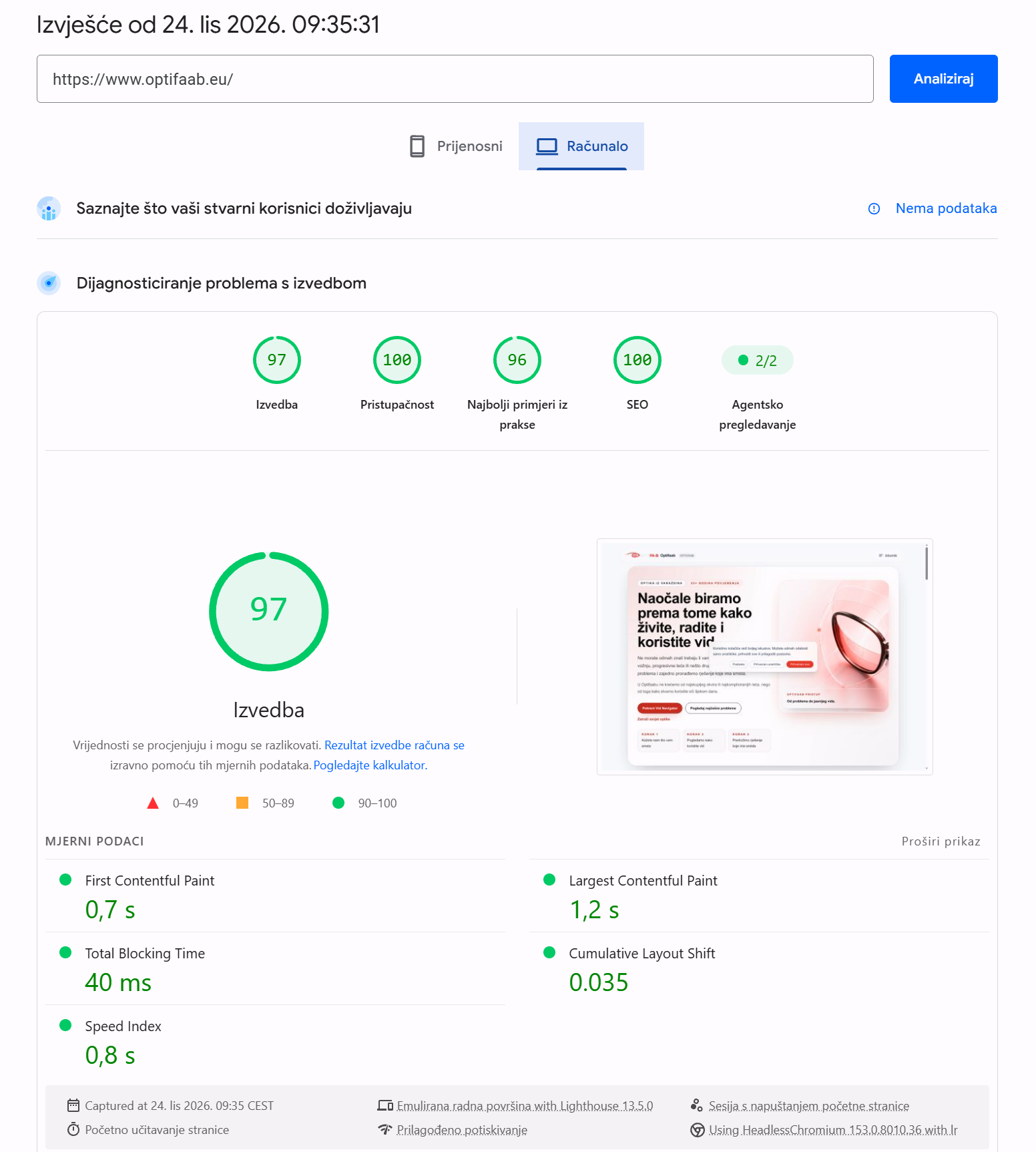
PageSpeed Insights · Lighthouse
24 October 2026 · desktop
A laboratory result for the desktop homepage under the conditions of that test. The report contains no field data from real users for Core Web Vitals. This is neither a mobile result nor a comparison with the previous website. The SEO score reflects the checks in the test, not a search engine ranking.
Tell us about your business and what you need.
You don’t need all the answers before our first conversation.